27 Landing Page Mistakes That Are Costing You Money

Sam Jacobs
Paid Search Director
9 min read
24th October 2024
In today’s fast-paced digital world, even the most creatively crafted marketing campaigns can fall flat if the landing pages they send users to are not optimised. In fact, poorly designed landing pages can waste not only your ad spend but also valuable resources—an outcome environmentally conscious companies should avoid at all costs
Why Should You Care About Landing Page Optimisation?
Your landing page is like the front door of your shop. If the door is hard to open, covered in confusing signs, or leads to a cluttered, chaotic space, customers won’t stick around—they’ll just walk away. Landing page optimisation is like making sure that the door opens smoothly, the signs are clear, and what’s inside is exactly what they came for.
Otherwise you might as well be paying for a big, flashy sign outside the shop, but locking the door and making it impossible for anyone to find what they’re looking for.
27 Landing Page Mistakes
1. Slow Page Load Times
Issue: Slow-loading pages frustrate users, leading to higher bounce rates and reduced conversions. Research shows that even a delay of a few seconds can cause visitors to abandon the page, wasting the money you spent to get the user there in the first place.
Solution:
- Optimise Image Size and Use Lazy Load: Compress images without sacrificing quality and implement lazy loading so that images only load when they become visible on the user’s screen. This reduces the initial page load time and helps deliver content more quickly to users.
- Minify CSS, JavaScript, and HTML: Remove unnecessary characters like spaces, commas, and comments from your code to reduce file sizes. This minimisation helps browsers load your content faster without affecting functionality.
- Reduce The Number of Redirects: Redirects increase server load times and slow your website.
- Invest in a Hosting Company: Using a fast, reliable and sustainable hosting service such as The Positive Internet Company can help improve landing page load times.
These improvements will ensure your page loads quickly and keeps users engaged.
2. Lack of Clear Call to Actions (CTAs)
Issue: When visitors can’t easily identify what action they should take next—whether it’s making a purchase or filling out a form—they’re likely to leave without converting. Vague or poorly placed CTAs confuse users and result in missed opportunities and wasted ad spend.
Solution:
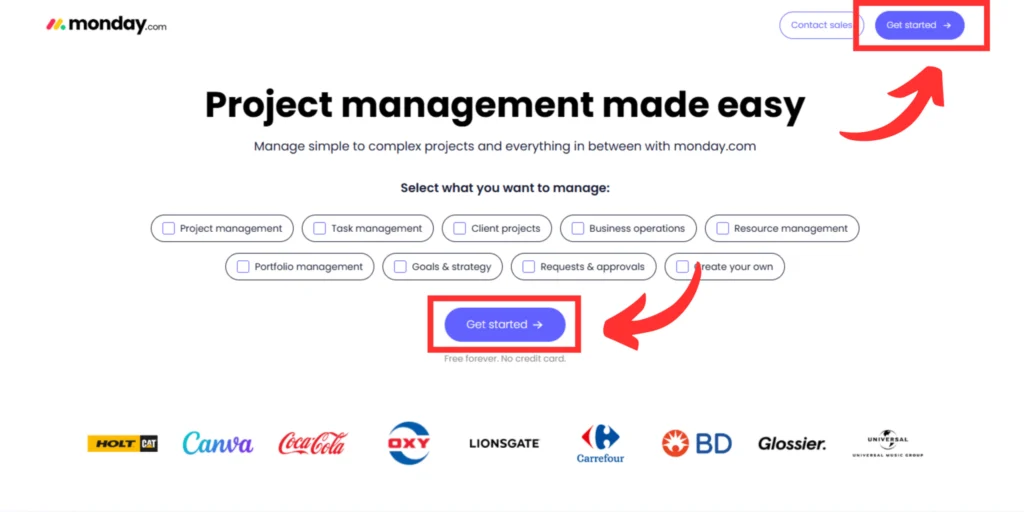
- Make Sure Your CTAs Stand Our: Ensure your CTAs are visually prominent by using contrasting colours that grab attention without clashing with your overall design.
- Use Clear, Action-Oriented Language: The text on your CTA should be direct and encourage specific actions. Phrases like “Get Your Free Quote” or “Start Your Free Trial” are much more effective than generic “Click Here” or “Submit.” Use language that tells visitors exactly what they’ll gain by clicking.
- Strategic CTAs Placement: Position your primary CTA in the most visible areas, such as above the fold (where visitors can see it without scrolling), or near key sections like product descriptions or testimonials. For longer pages, include multiple CTAs to capture attention at various points of the user journey.
- Create a Sense of Urgency: Encourage visitors to take immediate action by adding urgency to your CTA copy. Phrases like “Limited Time Offer” or “Only 5 Spots Left” can push users toward making quicker decisions, reducing the chances of abandonment. Be careful to use this suggestion sparingly to avoid appearing too pushy.
- Test and Optimise Regularly: Conduct A/B testing to find the most effective CTA variations. Test different button colours, placement, wording, and sizes to see which combinations drive the highest conversions.
3. Poor Mobile Optimisation
Issue: A significant portion of web traffic comes from mobile devices. Pages that are difficult to navigate, hard to read, or slow to load on mobile devices can lead to high bounce rates and lost conversions.
Solution:
- Implement a Responsive Design: On smaller screens, complex menus and navigation elements can overwhelm users. Use simplified, touch-friendly navigation menus that are easy to access with minimal taps.
- Optimise for Touch Interactions: Ensure all interactive elements—such as menus. buttons, and forms—are large enough and spaced adequately to be easily tapped without accidental clicks. Mobile users rely on touch, so design your page with larger buttons and plenty of space around clickable elements to reduce frustration.
- Prioritise Mobile Page Speed: Since mobile connections can be slower than desktop, it’s essential to prioritise mobile page load speed. Use mobile-specific image sizes, enable AMP (Accelerated Mobile Pages) where possible, and limit heavy scripts that slow down performance. A fast, responsive page will keep mobile users engaged longer and reduce the likelihood of bounces.
4. Overuse of Visuals and Cluttered Designs
Issue: While visuals can enhance engagement, too many images, videos, or graphic elements can clutter the page and slow down load times. This clutter distracts visitors from the main message and conversion goal.
Solution: Opt for a clean, minimalistic design that only uses visuals to support your key message. Each image or video should have a clear purpose, complementing the content without overwhelming the user. It’s important to balance white space and visuals to create the appearance of light and space.
5. Unclear Messaging or Inconsistent Copy
Issue: If there’s a disconnect between the message in your adverts, and the content on your landing page, visitors will feel misled or confused. This misalignment can increase bounce rates, reduce trust in your brand and increase wasted budget.
Solution:
- Ensure The Message Aligns Between Your Ad and Landing Page: Your landing page should directly reflect the promise made in your ad. If your ad promotes a specific product, discount, or feature, the landing page should prominently display that same offer.
- Keep Copy Clear and Relevant to User Intent: Use concise, straightforward language that answers the visitor’s main questions or concerns right away. Avoid vague or overly technical jargon that could confuse users.
- Maintain a Consistent Tone of Voice: Ensure that the tone and style of your copy match the voice used in your ad. If your ad has an energetic, upbeat tone, don’t greet visitors with formal or dry language on the landing page. A consistent tone builds familiarity and trust, making the user journey feel cohesive and reliable from start to finish.
6. Lack of Trust Signals
Issue: Visitors are less likely to engage with your landing page if they don’t feel confident in your business’s credibility. The absence of trust signals like testimonials or certifications can make users hesitant to convert.
Solution:
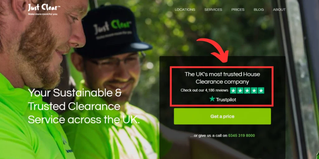
- Incorporate Testimonials and Reviews: Display real customer testimonials or reviews prominently on your landing page. Positive feedback from satisfied customers serves as social proof, showing new visitors that others have successfully interacted with your business. Including names, photos, or company logos (for B2B businesses) can further strengthen the authenticity of these endorsements.
- Showcase Trust Badges and Certifications: Add badges from recognised security platforms (like SSL certificates), industry certifications, or third-party endorsements (such as “Verified by Google” or “Trustpilot reviews”) to boost confidence. Security badges are especially important on landing pages involving transactions or personal data entry, as they reassure users that their information is protected.
- Highlight Case Studies or Success Stories: Provide detailed examples of how your product or service has helped other clients or customers. Case studies or success stories give potential buyers a deeper understanding of the tangible benefits you offer, while also demonstrating that your business has a proven track record.
By sharing real-world results, you build credibility and trust with new potential customers.
7. Ignoring User Experience (UX)
Issue: Poor UX, such as confusing navigation, cluttered layouts, or designs that aren’t user-friendly—creates frustration for visitors and leads to higher bounce rates. If users can’t easily find what they’re looking for, they’ll leave without converting.
Solution:
Streamline your landing page by simplifying the navigation and layout. Prioritise an intuitive user journey with clearly marked sections and buttons that lead visitors through the conversion process effortlessly.
- Simplify Navigation: Ensure that visitors can easily find the information they’re looking for with minimal effort. Limit the number of menu options and provide clear, straightforward navigation paths. For example, a single, well-placed “Learn More” or “Shop Now” button can guide users without overwhelming them with choices. Simplicity in navigation reduces cognitive load, making it easier for users to follow through on the intended action.
- Prioritise an intuitive user journey: Organise your landing page with a clear visual hierarchy that guides the user naturally from one section to the next. Key information—like headlines, benefits, and CTAs—should be positioned where they’re easily visible without the need to scroll too far. A logical flow ensures that users don’t get lost or distracted by unnecessary elements, keeping them focused on the primary goal of the page.
- Design for Intuitive Interactions: Ensure that buttons, links, and forms are intuitive and easy to interact with. Make sure CTAs are clearly labelled and that interactive elements respond in expected ways (e.g., buttons should change colour or animate slightly when hovered over, confirming they’re clickable). Simplify forms by reducing the number of fields and ensuring they are mobile-friendly.
By creating a seamless and intuitive user experience, you increase the likelihood that visitors will stay engaged and convert.
8. Forgetting SEO Fundamentals
Issue: Focusing solely on PPC without considering SEO can limit your page’s long-term performance. Even though PPC and SEO serve different purposes, combining them enhances both paid and organic reach.
Solution:
Apply basic SEO practices like optimising the header structure and page titles, including relevant keywords naturally in your copy, using descriptive alt text for images, and optimising meta tags. This approach will improve your page’s visibility and help it perform better in search results.
Here’s an example of how our work optimising a clients landing pages for Google Ads has improved their organic visibility also:

9. Lack of A/B Testing
Issue: A/B testing is essential for optimising your landing page. Without it, you’re essentially just guessing what works best for your audience. This means you could be using underperforming elements like weak CTAs, ineffective layouts, or unappealing headlines without even realising there’s a better option available. Missing these insights can leave significant opportunities for improvement on the table, resulting in lower conversion rates and wasted ad spend.
Solution:
- Test Key Elements like Headlines and CTAs: Headlines and CTAs are among the most important elements on your landing page. Test different variations of headlines and try different wording or button designs for CTAs. For example, “Get Started Now” might outperform “Learn More” depending on your audience’s intent.
- Page Layout and Visuals: Test different page layouts to determine what works best for guiding users through the content and keeping them focused on the conversion goal. You might experiment with minimalist designs versus more visual-heavy layouts, or test moving key elements like forms or testimonials higher up on the page.
- Experiment with Colour and Design Variations: Design elements such as colour schemes, button colours, and font styles can all influence user behaviour. Conduct A/B tests on these visual factors to determine which combinations resonate better with your audience.
- Analyse Audience Segments: Segment your audience and run A/B tests tailored to different groups. What works for one demographic might not work for another. By targeting specific audience segments (e.g., new visitors vs. returning customers), you can uncover deeper insights into what drives conversions for different user groups and refine your landing page accordingly.
Even small changes can lead to significant improvements in user engagement and conversions, so it’s important not to overlook the importance of A/B testing on your landing pages.
10. Poor Readability
Issue: If your landing page features dense text blocks, complex jargon, or a lack of formatting, visitors may find it overwhelming or difficult to digest. This poor readability can lead to disengagement and high bounce rates.
Solution:
Break up text into shorter paragraphs, use bullet points to list key information, and add clear headings and subheadings to make the content scannable. A simple, straightforward approach helps users engage with your message quickly.
- Break Up Large Blocks of Text: To improve readability, divide long paragraphs into shorter, more digestible chunks. Aim for no more than two to three sentences per paragraph to avoid overwhelming the reader. This makes the content easier to scan and helps maintain the user’s focus on key points without losing their attention.
- Use Bullet Points and Numbered Lists: Bullet points and numbered lists are excellent tools for presenting key information quickly and clearly. They allow users to skim through the most important details without having to read large blocks of text. This structure is especially useful for highlighting selling points, making it easy for visitors to grasp your message at a glance.
- Incorporate a Clear Header Structure: Clear, descriptive headings and subheadings help guide users through your landing page. They break up content into logical sections and allow visitors to quickly locate the information that’s most relevant to them. Well-placed headings also improve the overall flow of the page, making it easier for users to engage with the content and find exactly what they’re looking for.
- Ensure Readable Fonts and Contrast: Choose fonts that are easy to read, even on smaller screens or mobile devices. Opt for a clean, legible font size (typically 16px or larger for body text) and ensure there’s enough contrast between the text and background to make reading comfortable.
Proper readability is not just about the content itself, but also about the visual presentation that makes the text easier to process.
11. Weak or No Value Proposition
Issue: If visitors don’t see an immediate benefit or unique value in your offer, they’ll leave the page. A vague or unconvincing value proposition fails to capture attention or differentiate your brand from competitors.
Solution: Clearly communicate what makes your product or service unique. Highlight the tangible benefits or solutions your offer provides, ensuring visitors understand why it’s worth their time and attention.
Otherwise you risk wasting money getting a user to your landing page and then losing them by not selling the benefits of what you’re offering.
12. Excessive Form Fields
Issue: Long, complicated forms can be overwhelming and deter users from completing conversions. Visitors may hesitate to provide too much personal information initially, especially when it feels unnecessary.
Solution: Simplify your forms by asking only for essential information. The fewer fields a visitor has to fill out, the more likely they are to complete the process, leading to higher conversion rates.
You want to make it as easy as possible for the user to send you their information. Once they have, they can quickly become a customer, and if not, be added into your audience segments for nurturing and remarketing.
13. Poor Image Optimisation
Issue: Unoptimised, high-resolution images can slow down your page significantly, increasing the chances that visitors will leave before the page fully loads. This is especially detrimental for users on mobile devices or slower internet connections.
Solution:
- Compress Images Without Compromising Quality: Use tools like TinyPNG or ImageOptim to compress your images, reducing their file size without noticeably affecting visual quality. Smaller file sizes ensure faster page load times while maintaining the professional, high-quality appearance of your visuals.
- Use Modern Image Formats like WebP: Modern formats like WebP are specifically designed to be more efficient than traditional formats like JPEG or PNG.
- Implement Lazy Loading for Images: Lazy loading is a technique where images only load when they appear on the user’s screen, rather than all at once when the page initially loads. This reduces the time it takes for your above-the-fold content to display, speeding up the perceived load time.
14. Not Matching Audience Intent
Issue: If your landing page content doesn’t align with the intent of your audience—what they’re searching for or expecting after clicking on your ad—they will quickly lose interest and leave. This mismatch leads to high bounce rates and low conversion rates, as visitors feel the page doesn’t meet their needs or deliver on the promise made in the ad.
Solution:
- Align Ad Copy with Landing Page Messaging: Ensure that the messaging and tone used in your ads carry through to the landing page. If your ad promotes a specific offer or benefit (e.g., “50% off all products”), that same offer should be immediately visible on the landing page. This continuity reassures visitors that they’ve landed in the right place and that their expectations will be met.
- Match User Search Intent with Relevant Content: Understand the intent behind the keywords your audience is using. If they’re searching for information, your landing page should provide educational content or guidance. If they’re looking for a product or solution, your page should focus on clear product offerings and easy next steps.
Use Consistent Keywords and Phrases: Incorporate the same keywords and phrases from your ad into your landing page content. This creates a seamless experience for the user, as the language feels familiar and relevant to their search.
15. Not Optimising for Conversion Rate
Issue: Pages that focus more on design aesthetics than on driving conversions often underperform. Overly complex designs can distract users from taking action, hurting conversion rates.
Solution:
Prioritise conversion-focused design elements such as:
- Clear CTAs
- Simple navigation
- A strong value proposition
Every part of the page should guide visitors toward completing a desired action.
16. Inconsistent Branding
Issue: When the branding on your landing page doesn’t match the look, feel, or tone of your ads, it creates a jarring experience that undermines trust and confuses visitors.
Solution: Maintain consistent branding across all your touchpoints by using the same colours, fonts, and tone of voice. This consistency helps reinforce brand recognition and credibility.
17. Lack of Social Proof
Issue: Visitors are more likely to trust and engage with your brand if they see that others have had positive experiences. Without social proof, your landing page may seem untrustworthy, leading to hesitation or abandonment.
Solution: Add testimonials, customer reviews, or influencer endorsements to reassure visitors that others have had a successful interaction with your brand, building trust and credibility.
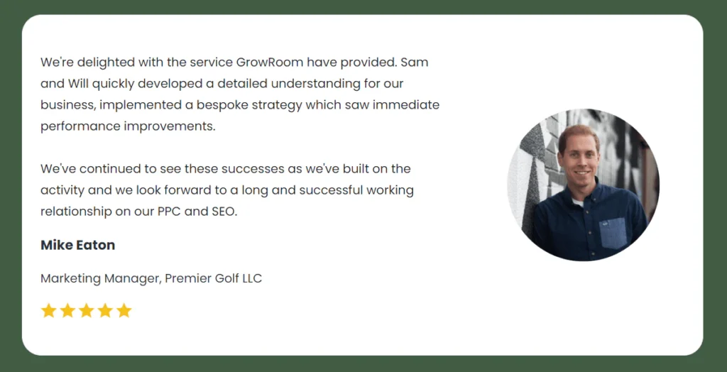
Using customer names and photos can make a huge difference in improving trust from social proof on your website, here’s an example of how we display a review for Mike, the Marketing Manager at one of our clients, Premier Golf on our reviews page:
18. Irrelevant or Over-the-Top Pop-Ups
Issue: I think we’ve all felt annoyed by excessive pop-ups on certain websites. Pop-ups that are intrusive, irrelevant, or poorly timed can irritate visitors, causing them to leave your page before taking any action.
Solution: If you need to, use pop-ups sparingly, ensuring they are relevant to the visitor’s journey and easy to dismiss. Timing is crucial—display them only when they add value to the user experience.
19. Misleading Promises
Issue: Overpromising or making unrealistic claims on your landing page can backfire, leading to distrust and high bounce rates. Visitors will feel disappointed if your offer doesn’t live up to their expectations.
Solution: Be honest and transparent in your messaging. Set realistic expectations and ensure your landing page accurately reflects the value you’re offering to build trust and reduce bounce rates.
20. No Personalisation
Issue: Generic landing pages that don’t speak directly to your audience’s needs or preferences can fail to engage visitors. Personalisation increases relevance and conversion rates.
Solution: Customise your landing page content based on user demographics, behaviour, or location. This can include personalised greetings, tailored offers, or recommendations that align with their interests.
21. Not Capturing Email Addresses
Issue: Failing to capture leads means missing out on future opportunities to engage and convert visitors. Without an email capture strategy, you lose potential customers.
Solution:
- Embed a Simple, Visible Signup Form: Add an email capture form that offers visitors an incentive to subscribe, such as a discount or free resource. Keep the form simple and make the benefit clear.
- Offer a Lead Magnet: Provide an incentive, such as a free e-book, discount, or exclusive content, in exchange for a visitor’s email address. This lead magnet should be relevant to your audience and offer real value, encouraging them to subscribe. For example, offering “10% off your first purchase” or a “Free sustainability guide” gives visitors a reason to sign up.
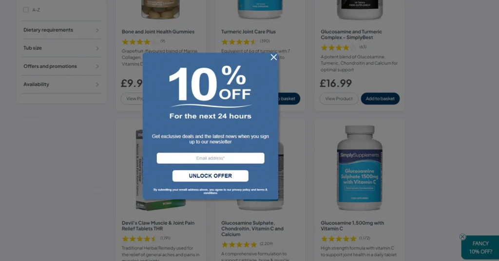
Use Exit-Intent Pop-Ups: Only use pop-ups sparingly and when necessary. In some cases, using exit-intent pop-ups that trigger when users are about to leave the page can be a good way to capture a user’s information. Since visitors are already on their way out, this last attempt can help capture their contact details before they go, boosting lead generation.
22. Too Much Distraction
Issue: Landing pages cluttered with excessive ads, links, or multimedia elements can distract visitors from the main conversion goal, leading to higher abandonment rates.
Solution:
- Focus on a Single CTA: Design your landing page with a single, clear goal in mind, whether it’s signing up for a newsletter, making a purchase, or filling out a form. Avoid multiple competing CTAs that can confuse visitors.
- Minimise External Links: Remove non-essential elements such as extra navigation links, social media buttons, or unrelated ads. External links can lead visitors away from your page before they complete the desired action.
- Use a Clean Design: Opt for a clean and minimalist design that prioritises white space, making key content and CTAs stand out. Limit the use of flashy animations or autoplay videos that can pull attention away from the conversion point.
A clear, visually simple layout helps guide visitors smoothly toward the desired action without overwhelming them.
23. Not Leveraging Video
Issue: Whilst in some cases, video is unnecessary and can lead to a reduction in conversions, for others, video can be a powerful tool for explaining complex ideas.
Solution: Incorporate short, engaging videos that explain complex solutions in a concise, easy to understand format. This can increase user engagement and improve conversion rates.

24. Failure to Build Urgency
Issue: Creating a sense of urgency can be an effective tool to encourage a user to take action. However, scarcity tactics need to be used with caution, because creating a false sense of urgency can make the landing page seem fake and pushy.
Solution:
Create urgency by incorporating tactics like;
- Limited-time offers
- Countdown timers
- Stock availability notices
These elements encourage visitors to act immediately rather than putting off a decision until later.
25. No Clear Next Step
Issue: If visitors don’t know what action to take next, they’ll leave the page without converting. A lack of direction can cause confusion and reduce conversion rates.
Solution: Guide users through the conversion process by providing a clear, obvious next step—whether it’s filling out a form, making a purchase, or signing up for a service. Make sure the next action is easy to identify and follow.
26. Not Testing for Different Browsers
Issue: Your landing page might display perfectly on one browser but break or perform poorly on others. If visitors experience issues on their preferred browser, they’ll likely leave without converting.
Solution: Regularly test your landing page across multiple browsers, including Chrome, Firefox, Safari, and Edge. This ensures that your page functions well for all users, regardless of their browser choice.
27. Over-reliance on Stock Images
Issue: While stock images are easy to use, they can appear inauthentic or generic, reducing the personal connection visitors feel with your brand. Overused stock images may also be recognised by visitors, diminishing trust.
Solution: Use original, high-quality images that are specific to your business or product. Custom visuals help build authenticity and a stronger connection with your audience.
Reducing Landing Page Waste
Efficient landing pages are essential for maximising the impact of your ad campaigns. Poorly optimised landing pages lead to wasted ad spend, missed opportunities, and the underutilisation of valuable data. Well-optimised landing pages not only improve your return on investment but also minimise the waste of time, money, and valuable resources.
Conclusion: Clean Up Your Landing Pages for Success
By addressing these 27 landing page mistakes, you’ll improve your PPC performance, reduce waste, and ultimately drive better results. Efficient landing pages are a win-win for your business’ bottom line and sustainability.
If you need help understanding how to craft compelling landing pages that capture your audience’s interest, speak to our specialist team today.
Categories:
Content, SEO, UK
Frequently asked questions
How often should I update or optimise my landing page?
It’s a good idea to review and optimise your landing page regularly—at least every few months or whenever you launch a new ad campaign. Continuous A/B testing, monitoring performance metrics, and updating content or visuals in line with user behaviour trends will ensure your landing page remains efficient and high-converting.
What is a good page load time for a landing page?
Ideally, your landing page will load as quickly as possible. But best practice is that your landing page should load in under 3 seconds. Anything slower can significantly increase bounce rates as users lose patience and leave. Compressing images, reducing redirects, and using fast hosting services can help improve load times.
What’s the best way to reduce my landing page’s bounce rate?
To lower bounce rates, ensure your landing page aligns with audience intent and has a clear, compelling message. Focus on fast load times, easy navigation, and prominent CTAs that guide users toward a specific action. A clean design free of distractions also helps keep visitors engaged.
Get in touch
Contact Form
Get our digital marketing insights straight to your inbox
